Facebook Ad Copy in 2026: How to Write Primary Text, Headlines and CTAs That Convert (With Examples)
How I write Facebook and Instagram ad copy in 2026, from the first lines of primary text to headlines, descriptions and call to action buttons, with examples and templates you can adapt.
On this page▼
- The Parts of a Facebook Ad
- How to Write Primary Text That Gets Read
- Three ways to open your primary text
- Structure it for scanning
- Match the copy to the creative and the audience
- How to Write Facebook Ad Headlines
- Descriptions: Spend Three Minutes, Not Three Hours
- How to Choose the Call to Action Button
- Facebook Ad Copy Examples
- Online shop
- Local service business
- B2B software
- Coach or course creator
- Test Your Copy the Smart Way
- Make the Landing Page Keep the Promise
- Common Facebook Ad Copy Mistakes
- Frequently Asked Questions About Facebook Ad Copy
- Write for the Scroll, Then for the Click
Good Facebook ad copy does three jobs in order. The first line of the primary text stops the scroll, the headline adds a clear value in about 25 to 30 characters, and the call to action button matches how ready people are to act. Open with a pain point question, a surprising fact or a specific promise, keep the copy easy to scan, and make sure your landing page delivers exactly what the ad promised.
| Element | What shows | How I write it |
|---|---|---|
| Primary text | The first three or four lines before See more, about 125 characters | Open with a pain point question, a surprising fact or a specific promise |
| Headline | Often only 25 to 30 characters before Meta cuts it off | One clear value, ideally with a number, a timeframe or a concrete promise |
| Description | Not shown in every placement | Short social proof, and no more than three minutes of thought |
| Call to action button | Shown in most placements | Matched to how ready people are, like Shop Now for impulse buys and Learn More for considered ones |
| Variations | Meta can mix several versions | Up to five primary texts and five headlines per ad, each with a genuinely different angle |
Last updated: 27 October 2026.

Victoria Alenich · Meta Ads Consultant · $35M+ · Work with me
Victoria Alenich
Meta Ads Consultant · $35M+ managed · Work with me
I've managed $35M+ in Meta ad spend across 50+ brands, and I consider your copy the second most important part of an ad after the creative itself. The visual stops the scroll, but the words decide whether people understand what you offer and feel ready to click. Strong copy can't save a weak creative, while weak copy can easily waste a strong one.
This guide covers each part of the copy in the order people see it, the openers and structures I use, examples for different businesses and the mistakes I see most often. For the visual side of your ads, read my guide to what makes Facebook ad creative work.
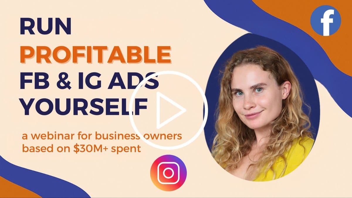
Watch my free 63 minute Meta Ads Foundations Training, where I show how Meta decides who sees your ads, how to set up tracking and how to test creative.
The Parts of a Facebook Ad
Every Meta ad has the same building blocks, though not every placement shows all of them.
- Primary text appears above your creative in the Facebook feed and below it in the Instagram feed.
- The creative is your image or video, and it's the part that stops people scrolling.
- The headline is the bold line next to the button in the feed.
- The description is a short line under the headline, which many placements don't show.
- The call to action button tells people what happens when they click, like Shop Now or Learn More.
In Stories and Reels, the text overlays inside your video often matter more than the primary text, since the caption is partly hidden. My Meta ad specs cheat sheet shows how much of each field appears in every placement.
How to Write Primary Text That Gets Read
Here's something most advertisers miss. Only the first three or four lines of your primary text show before the See more link, so those lines have to work on their own.
I once worked with a client who had an amazing product video, but their primary text started with Welcome to our brand. Nobody clicked See more, because nobody cares about being welcomed to a brand they don't know yet.
Three ways to open your primary text
- Ask a question that hits a pain point. For example, Tired of losing leads because your team can't follow up fast enough? It speaks to one specific problem straight away.
- Share a surprising fact. A fact that challenges what people think they know makes them want to read on, as long as it's true and you can back it up.
- Make a bold but specific promise. Not Improve your business, but something concrete with a result and a timeframe that you can actually deliver.
Structure it for scanning
On their phones, people scan ads rather than read them, so each line of your primary text has a job.
- Line one stops the scroll with the question, fact or promise.
- Line two expands on the problem or the situation your customer is in.
- Line three presents your solution or the main benefit.
- The last line is a clear call to action, telling people exactly what to do next.
Spacing makes a real difference here. In my testing, simply adding line breaks between ideas has increased click through rates by up to 30%, because the copy becomes easy to scan on a small screen.
Match the copy to the creative and the audience
Your copy and your creative should tell one story. If your video shows a busy parent cooking a quick dinner, the primary text should speak to that same situation, not to a generic list of product features.
The copy also has to fit the people you want to reach. I once had a client targeting CEOs with ads that looked and sounded like they were made for entry level employees, and the data showed it straight away in a high CPM, a low click through rate and a poor conversion rate.
How to Write Facebook Ad Headlines
You only get about 25 to 30 characters before Meta cuts your headline off with three dots in many placements, even though it allows longer ones. That's why I use what I call the instant value rule. Your headline has one job, which is to reinforce your main message with a value someone scrolling at speed understands immediately.
| Business | Vague headline | Specific headline |
|---|---|---|
| E-commerce | Great Deals on Shoes | Save 40% On Running Shoes |
| B2B lead generation | Grow Your Pipeline | Generate 50 Leads in 30 Days |
| Any business | Grow Your Business | 3X Your Revenue |
Think about your own scrolling behavior. What makes you stop is usually a number, a timeframe or a clear promise of value, which is why headlines with specific numbers tend to beat generic ones. For B2B it's all about results and timeframes, so a headline that's specific, measurable and time bound usually wins, as long as you can deliver it.
Descriptions: Spend Three Minutes, Not Three Hours
The description doesn't show in every placement, and I've seen advertisers spend hours on descriptions that most of their audience never sees. A good use is a short line of social proof, like Trusted by 10,000+ pet owners if that's true for your business. Beyond that, I wouldn't spend more than three minutes on it.
How to Choose the Call to Action Button
The button can change your results more than you'd expect, and I've seen conversion rates vary by up to 20% just by changing it. Your creative stopped the scroll, your primary text got people interested and your headline reinforced the value, and then a button that doesn't match where people are in their journey can lose them.
| Situation | Button that usually fits | Why |
|---|---|---|
| Lower priced products bought on impulse | Shop Now | People are ready to buy straight away |
| Expensive or considered purchases | Learn More | People want to research before they commit |
| Free trials, demos or sign ups | Get Started or Sign Up, tested against each other | A softer button can feel less committal |
| Lead magnets and free content | Download or Learn More | The button should describe what people get |
I learned this working with a high end furniture brand that used Shop Now for everything. For lower priced items it worked well, but for luxury pieces Learn More drove more sales, because nobody impulse buys a $13,000 sofa. For a B2B software client, changing Sign Up to Get Started on a demo campaign lifted the conversion rate by 15%, with the same landing page and the same offer.
Thinking about trying Meta ads? Start here.
Watch the free Meta Ads Foundations Training to understand tracking, creative and testing before you commit to a course or consulting.
Facebook Ad Copy Examples
These are examples of how I'd structure copy for different businesses. Treat them as templates, replace the details in brackets with your own, and only use claims you can prove.
Online shop
Still buying running shoes that hurt after the first 5 km?
[Brand] shoes are built for [specific benefit], so your feet feel fresh at the end of a long run.
Free returns for 30 days, so you can test them on your own route.
Find your size today.
Headline: Save 40% On Running Shoes. Button: Shop Now.
Local service business
Need a [service] in [city] this week?
Most people wait weeks for an appointment. We keep slots free every week for new clients.
Book online in two minutes and get a reminder the day before.
Headline: Book Your Visit This Week. Button: Book Now.
B2B software
How many hours does your team spend on [manual task] every week?
[Product] does it automatically, so your team can focus on [valuable work].
Join [number] companies already using it, and see your own results in a free demo.
Headline: Save [X] Hours Every Week. Button: Get Started.
Coach or course creator
Want to [specific result] without [common frustration]?
In my free training I show you the exact steps I use with my clients, from [first step] to [result].
It takes [time], and you can watch it today.
Headline: Free Training: [Result]. Button: Learn More.
Test Your Copy the Smart Way
Meta lets you add up to five versions of your primary text and five headlines to one ad, and it mixes them to find what works best. Use that space for genuinely different angles, like one version leading with the problem, one with a result and one with social proof, rather than five ways of saying the same thing.
Meta can also create text variations for you with its Advantage+ creative features. Some of these features improve performance and some can hurt it, so test them one at a time, running the same ad with and without each feature, and let your results decide.
Different openings attract different customers. When we tested four hooks on the same skincare video, the before and after version brought in people who wanted proof, while the problem version brought in people actively looking for a solution. The same thing happens with copy, so it's worth writing for more than one type of buyer.
Make the Landing Page Keep the Promise
Your ad is a promise, and your landing page is where you deliver it. I call this the three second rule, because people decide within about three seconds whether they're in the right place.
I once had a fitness client whose ad promised 15 minute workouts for busy professionals and got clicks for $1, which was great for their industry. Nobody converted, because the first thing people saw on the landing page was a long text about the company's history. Whatever your ad promises, whether it's a discount, a free guide or a specific result, should be the first thing people see after they click.
Common Facebook Ad Copy Mistakes
- Opening with your brand name or a welcome. The first line should be about the customer and their problem.
- Vague promises. Grow your business tells people nothing, while a specific result with a timeframe gives them a reason to stop.
- A wall of text. Without line breaks, people scroll past even good copy.
- A headline that's cut off. Put the value in the first 25 to 30 characters.
- The same button for every offer. Match it to how ready people are to act.
- Claims you can't prove. Specific numbers work, but only when they're true for your business.
- Copy that doesn't match the landing page. If the ad promises a discount, show the discount the moment people arrive.
Frequently Asked Questions About Facebook Ad Copy
Open the primary text with a pain point question, a surprising fact or a specific promise, then expand on the problem, present your solution and end with a clear call to action. Keep it easy to scan with line breaks, write a headline with one clear value in about 25 to 30 characters, and match the button and the landing page to what the ad promises.
Write for the Scroll, Then for the Click
Great ad copy is simple. Stop the scroll in the first line, make the value obvious in the headline, ask for the right next step and keep the promise on your landing page. Then test a few genuinely different angles and let your results tell you which words your customers respond to.
If you want to see how copy, creative, tracking and testing fit together, my free Meta Ads Foundations Training walks through the whole process.
Start with the free training
Watch my free 63 minute Meta Ads Foundations Training, where I show how Meta decides who sees your ads, how to set up tracking and how to test creative.

Victoria Alenich
Meta Ads consultant who has managed $35M+ in ad spend across 50+ brands including foodspring and Asana Rebel. Specializing in creative strategy, campaign architecture, and AI-powered ad workflows for brands spending $10K+/month.